Visualizing Real-Time Traffic in DC Amid Curfew After Riots
Written on
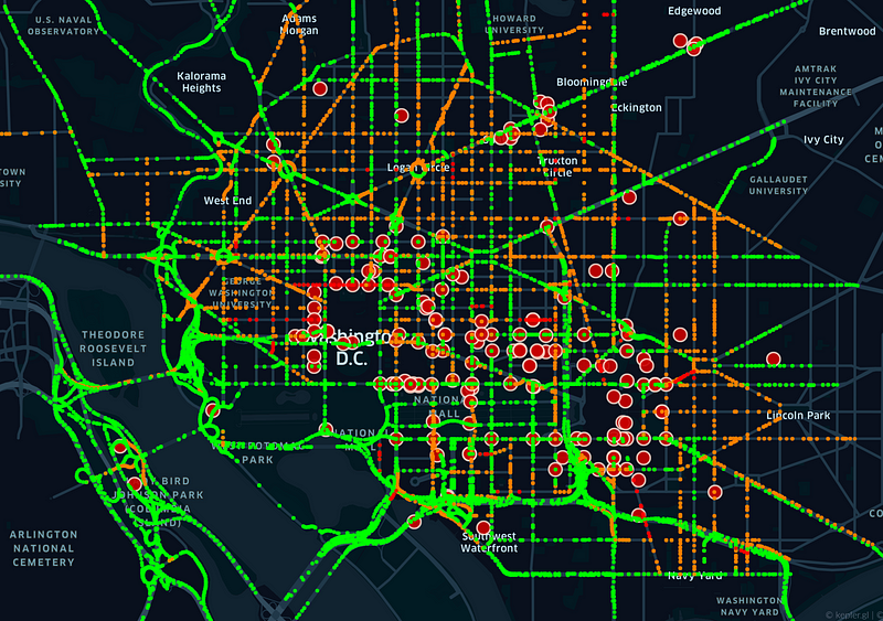
In the wake of today's unfortunate disturbances, the need for mobility in urban environments has become increasingly apparent. By utilizing the HERE traffic flow and incident API, we can visualize real-time traffic conditions in Washington, DC during the enforced curfew.

Today's riots led to chaos and tragic outcomes. Fortunately, many data providers are offering free access to real-time, detailed information that can be invaluable for first responders and the public during emergencies. This article explores the potential of quantifying real-time incident and traffic flow data using one such API.
While Google Maps excels in suggesting routes that minimize travel time, it doesn't provide access to underlying traffic data. Other providers like TomTom, Waze, and HERE offer real-time traffic information. Among these, I find HERE to be the most user-friendly, and its free API invaluable for acquiring detailed data on traffic speeds and incidents. In a prior blog post, I demonstrated how to use the HERE traffic flow API to extract speed data at the level of individual road segments.
Here, I will show you how to extract traffic incident data and compare it with speed data from HERE against images from Google Maps.
%matplotlib inline import numpy as np import requests from bs4 import BeautifulSoup import xml.etree.ElementTree as ET from xml.etree.ElementTree import XML, fromstring, tostring
The following code snippet retrieves traffic incident data from HERE:
page = requests.get('https://traffic.api.here.com/traffic/6.2/incidents.xml?app_id=BLAH&app_code=BLAH2&bbox=38.92,-77.06;38.88,-77.00&responseattributes=sh,fc') soup = BeautifulSoup(page.text, "lxml") incidents = soup.find_all('traffic_item')
To access HERE's API, you must register to obtain an app ID and app code (represented as BLAH and BLAH2 in the example). Next, you need to define a bounding box for the area of interest. You can easily find the latitude and longitude pairs using Google Maps for the top left and bottom right corners of your bounding box. The response attributes 'fc' and 'sh' are beneficial for filtering data, but they are not used in this analysis. The last line of code retrieves the unique incidents occurring at that time.
myxml = fromstring(str(incidents[0])) for child in myxml:
print(child.tag)
The first incident reveals 16 tags containing valuable information such as start and end times, descriptions, and locations. My primary interest lies in the incident's latitude and longitude. However, this information is not as straightforward as it is for traffic speeds. After some exploration, I discovered it within the location tag.
myxml = fromstring(str(incidents[0])) for child in myxml:
if (child.tag == 'location'):
for chelds in child:
print(chelds.tag, chelds.attrib)
Eventually, I found the latitude and longitude under the 'geoloc' tag.
<geoloc><origin><latitude>38.88507</latitude><longitude>-77.01081</longitude></origin><to><latitude>38.88602</latitude><longitude>-77.01051</longitude></to><geometry><shapes><shp fc="5" fw="SD" le="0.042374034341961575" lid="1186813844F">38.88507,-77.01081 38.88544,-77.01069</shp><shp fc="5" fw="SD" le="0.06625476521319096" lid="1254739814F">38.88544,-77.01069 38.88602,-77.01051</shp></shapes></geometry></geoloc>
You can also identify the types of incidents present. On January 6, 2021, at approximately 9 PM, DC experienced a total of 173 incidents, all categorized as either road closures or planned events. Below are the details of the first ten incidents. Note: The time reported by HERE may not be in Eastern Standard Time (EST); it could be GMT, but this remains uncertain.
for inc in incidents:
print(inc.start_time.text, inc.end_time.text, inc.traffic_item_type_desc.text)
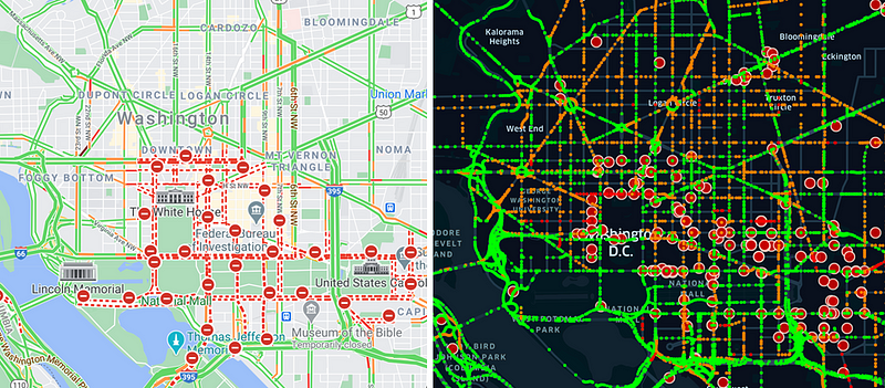
Now, let’s compare HERE traffic speeds/incidents with Google Maps, as promised.

The differences are intriguing. HERE provides a greater number of incidents and more speed data on smaller road segments. Without Google Maps data for reference, it can be challenging to visually ascertain the similarities or differences in speeds. Additionally, it's unclear how Google Maps determines speed classifications by color. Google Maps employs four colors to indicate speed levels from slow to fast (dark red, red, yellow, green). I created a similar color mapping for HERE, categorizing road colors based on speed relative to the speed limit.
HERE serves as an excellent resource for acquiring real-time information that is unavailable through Google Maps. Furthermore, HERE appears to offer more detailed traffic data for smaller road segments, and they claim to be the world's leading location platform—a bold assertion. The only drawback is the lack of historical traffic data, though this may change in the future.
As illustrated by today's events, groups can sometimes act collectively in unthinkable ways, leading to significant harm. In such scenarios, it is crucial to have an accurate understanding of the evolving situation. The recent incidents demonstrate how the DC government was largely unprepared for the magnitude of protests and the rapidity with which the Capitol was compromised.
Integrating real-time traffic data with other sources, such as social media feeds, can provide a societal pulse. These data offer actionable insights for city stakeholders, including law enforcement and emergency responders, empowering them to accurately gauge the severity of situations and make informed decisions when time is critical.
If you enjoyed this article, consider following me—I regularly write about the intersections of complex systems, physics, data science, and society.