Visualize Your Data: Interactive Charts with Obsidian Charts
Written on
Chapter 1: Introduction to Obsidian Charts
Have you ever wanted to visualize the data you keep in your vault? For instance, if you maintain daily notes that track your weight, it could be beneficial to see your weight loss journey represented through charts. This is achievable with Obsidian Charts, a tool that requires the Dataview plugin to handle dynamic data effectively.

Section 1.1: Basic Syntax for Chart Creation
Obsidian Charts utilizes YAML syntax to define chart properties. Here’s a fundamental structure to get you started:
chart
type: ""
labels: []
series:
title: ""
data: []
title: ""
data: []
- chart: This indicates to Obsidian that you’re working with charts.
- labels: These are the labels for your chart.
- series: This section outlines the data series, where you can assign titles (though this is optional).
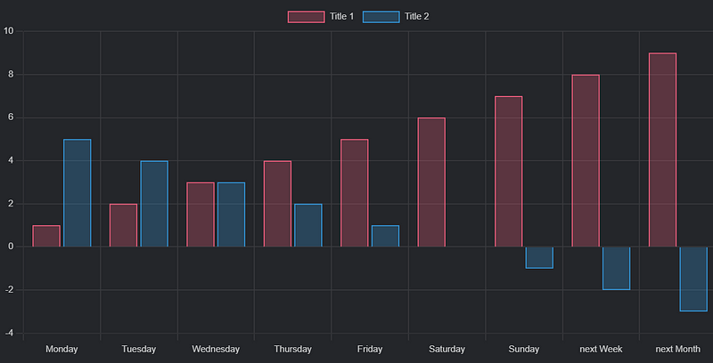
To illustrate, let’s examine the following code snippet (sourced from official documentation):

chart
type: bar
labels: [Monday, Tuesday, Wednesday, Thursday, Friday, Saturday, Sunday, "next Week", "next Month"]
series:
title: Title 1
data: [1, 2, 3, 4, 5, 6, 7, 8, 9]
title: Title 2
data: [5, 4, 3, 2, 1, 0, -1, -2, -3]
In this example:
- type: Set to "bar" to display a bar chart. Other options include "pie," "doughnut," "line," "polarArea," and "radar."
- labels: Clearly outlined.
- series: Two series are defined, each with distinct titles and colors assigned automatically by Obsidian Charts.
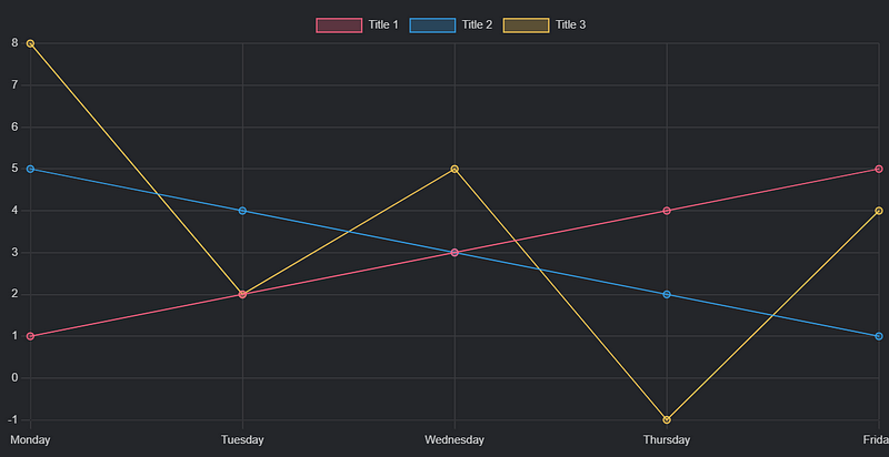
If you comprehend the syntax, you should be able to predict the output of the next code snippet:
chart
type: line
labels: [Monday, Tuesday, Wednesday, Thursday, Friday]
series:
title: Title 1
data: [1, 2, 3, 4, 5]
title: Title 2
data: [5, 4, 3, 2, 1]
title: Title 3
data: [8, 2, 5, -1, 4]

Section 1.2: Common Errors in YAML Formatting
If you encounter errors while copying your code, ensure that you adhere to YAML syntax rules, particularly with indentation. For instance, the following code will not work due to improper formatting:
chart
type: line
labels: [Monday, Tuesday, Wednesday, Thursday, Friday]
series:
- title: Title 1
data: [1, 2, 3, 4, 5]
However, the following properly formatted code will succeed:
chart
type: line
labels: [Monday, Tuesday, Wednesday, Thursday, Friday]
series:
title: Title 1
data: [1, 2, 3, 4, 5]
title: Title 2
data: [5, 4, 3, 2, 1]
title: Title 3
data: [8, 2, 5, -1, 4]
Chapter 2: Using the Visual Editor
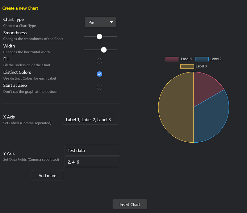
To make chart creation easier, you can utilize the visual editor that comes with Obsidian Charts. Access it via the command palette by searching for the “Insert new chart” command, which will guide you through the process.

Section 2.1: Integrating Dataview for Dynamic Data
The examples provided so far are limited because they rely on manually entered data. For more complex functionality, consider the Dataview plugin, which allows for dynamic data usage. If you’re unfamiliar with it, you can refer to the documentation for guidance on DataviewJS.
Using DataviewJS, you can create charts with the following structure:
window.renderChart(data, element)
Where:
- element: Usually refers to this.container, the area where the chart is displayed.
- data: This is where it gets interesting, as you can query data from your vault.
Here's an example that shows how to define your chart data:
const chartData = {
type: '',
data: {
labels: [],
datasets: [{
label: '',
data: [],
backgroundColor: [
''],
borderColor: [
''],
borderWidth:
}]
}
}
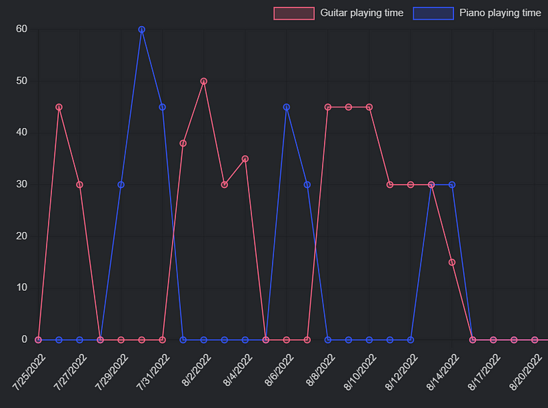
The above structure is quite explicit. For instance, if you want to track your daily music playing time, you might use the following code:
const data = dv.current()
const chartData = {
type: 'bar',
data: {
labels: [data.test],
datasets: [{
label: 'Grades',
data: [data.mark],
backgroundColor: [
'rgba(255, 99, 132, 0.2)'],
borderColor: [
'rgba(255, 99, 132, 1)'],
borderWidth: 1
}]
}
}
window.renderChart(chartData, this.container);
The data.test will automatically be replaced with "First Test," and data.mark will update with the value 6.
Finally, here’s a sample code used to track daily music playing time, broken down step by step for clarity:
let dvData = dv.pages('"600 Periodic/610 Daily"').filter((value) => value.file.path != "600 Periodic/610 Daily/610 Daily.md")
function bblSort(arr) {
for (var i = 0; i < arr.length; i++) {
for (var j = 0; j < (arr.length - i - 1); j++) {
if (arr[j] > arr[j + 1]) {
var temp = arr[j]
arr[j] = arr[j + 1]
arr[j + 1] = temp
}
}
}
return arr
}
const datetimes = bblSort(dvData.values.map(value => value['full-date']))
let sortedDvData = []
for (let i = 0; i < datetimes.length; i++) {
for (let j = 0; j < dvData.values.length; j++) {
if (dvData.values[j]['full-date'] == datetimes[i]) {
sortedDvData.push(dvData.values[j])}
}
}
const dates = sortedDvData.map((value) => new Date(value['full-date']).toLocaleDateString('en-us'))
const guitarPlayingTimes = sortedDvData.map((value) => value.guitar)
const pianoPlayingTimes = sortedDvData.map((value) => value.piano)
const chartData = {
type: 'line',
data: {
labels: dates,
datasets: [
{
label: 'Guitar playing time',
data: guitarPlayingTimes,
backgroundColor: [
'rgba(255, 99, 132, 0.2)'],
borderColor: [
'rgba(255, 99, 132, 1)'],
borderWidth: 1
},
{
label: 'Piano playing time',
data: pianoPlayingTimes,
backgroundColor: [
'rgba(51, 85, 255, 0.2)'],
borderColor: [
'rgba(51, 85, 255, 1)'],
borderWidth: 1
}
]
}
}
window.renderChart(chartData, this.container);
Final Thoughts
Now you have the knowledge to create charts in your Obsidian Vault using Obsidian Charts. If you're eager to learn more about this plugin, don’t hesitate to explore the official documentation for additional chart types like pie and radar charts.
If you’re interested in discovering other plugins or learning more about self-improvement, be sure to check out my other stories.
If you enjoyed this content, please consider showing your support and following me for more insightful articles. You can also subscribe to receive notifications for new posts directly in your inbox!
This video demonstrates how to effectively utilize data visualization in Obsidian using Obsidian Charts.
In this video, learn how to leverage the Graph View feature in Obsidian for enhanced data insights.